PROJECT OVERVIEW
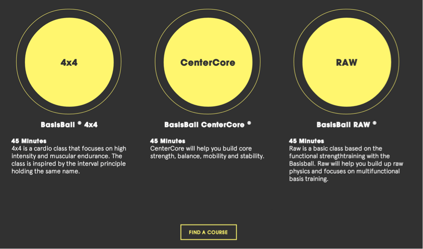
Back to start is a company with a training concept called “BasisBall”. This concept is conveyed through their website and presented in two different ways. The first is for registered users (“trainers”) and requires an account to access. This type of account is granted to personal trainers at fitness centres that have joined the program. Through the account they can subscribe to 3 different types of programs, which will allow them to teach the respective program at their fitness centre.
Casual users are given a different approach to the concept. By attending courses of various levels of difficulty, they train with Back to Starts staff of certified BasisBall trainers and can subscribe to the corresponding program they are enrolled in.
By subscribing, both user groups get access to a third party service that serves as a “trainer portal”. The service is called BRIK that will let users watch videos of the training programs online as well as download the corresponding music.
THE CHALLENGE
Research conducted indicated that users find it confusing to navigate and use the website to locate information. In addition, the link between the website and the third party portal is not clear. As part of the upgrade the client also wanted to implement an eCommerce shop with a more automated flow.
PROJECT APPROACH
The current website went through an heuristic evaluation to identify usability problems and a select group of current users were asked to perform various key tasks to see how they interact with the website. Some of the most concerning results were:
- Users unfamiliar with the website was confused by the difference between courses and subscription.
- Distinguishing the concept and brand name is difficult
- Many steps are required to subscribe for a service. Some users might not be able to complete the process
- Not filling out the payment form properly or unable to complete the form
Stakeholder interviews were conducted and user surveys were sent out to gather more data about the current website.
Based on all of this, the key goals for the new site became clear: Make the distinction between brand and concept clear as well as present the information in a more structured and logical way. The webshop also needed to be addressed to make the shopping experience easier and more intuitive.
PROTOTYPING
To achieve the best possible result, several users tested various prototypes where each iteration used feedback to test out new ideas or changes.
The test sessions took place at the participant’s home to evaluate the user in a natural setting. The survey showed that the end users of the product will most likely access the website from home, so this was done to get the most accurate data.
After each session, the participants were asked about what they thought worked well and not so well on the website. In addition, they were encouraged to suggest design changes that might benefit the website. This feedback has been very valuable for the development of the new prototype. For instance, all participants were confused over the fact that they were redirected to the homepage after logging in.
Example of how information was structured after a couple of iterations.
PROPOSED SOLUTION
Some of the implemented solutions are presented below.
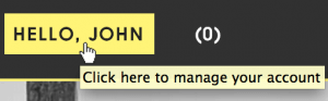
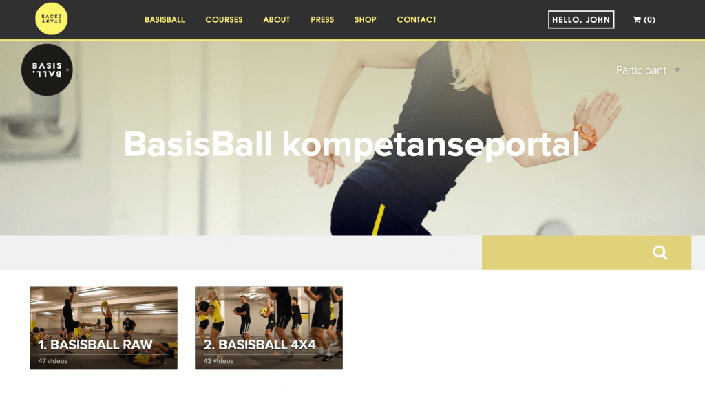
Results from the tests showed that participants failed locating the account page. As a result, they could not access their own account and perform key functions like subscribe to a training program.
Most of the participants had no problem logging in to the account, but after login they were redirected back to the index (BasisBall) page which confused all of the participants. Even though the “trainer” link in the main navigation had been changed to their own name, it was not clear enough that the link was clickable.


Left: New button added to make the link more visible.
Middle: Add a “tooltip” that make it clear that this is clickable.
Right: New button hover effect follows the styleguide of the website.
Users have difficulties seeing the difference between the brand and concept. This was a known problem and the usability tests validates this. To help with this, the Basisball (concept) logo was swapped with the brand logo:
![]()
Original navigation bar.
![]()
Swapped out logo from BasisBall to Back to Start.
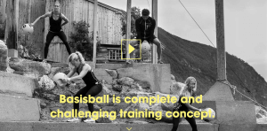
The second recommendation implemented is having a video presentation of the concept as the first thing the visitor can see when entering the home page. In addition the phrasing has been simplified:
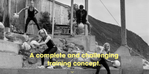
Left: The original header image.
Right: Iterated header image with play button for video and rewritten text. “BasisBall” is added to clarify that this is the concept thats being presented.
The divide between the third party service BRIK and the Back to Start website makes users uncertain of where they are. To solve this, the third party service was loaded into the body content to preserve the header and footer content.
If you want more information about this project, please contact me at matias@designkompaniet.no